"A few things I would look at or try
- more than one person. the torch sequence may look more effective with more people, the sequence with the car headlights that may also look effective with more than one person?
- 0:46 i like this as one person
- The fade from her face to the tree/moon i like
- are we ment to see the torch in her hand as it comes away from her?
- maybe try and get a field if that is where you want where there is less background i for one got pretty distracted by it.
Overall i think this looked like a worthwhile practice, Check out the editing pace and style, the bit going from the dark torch to the car was very quick i don't know wheher thats the ffect you were after though. maybe bring the car bt in when the singing restarts as i think i heard as 'as the light still burns within' which may make the footage more relevent?
The change in colour tone from 0:45 onwards i think is effective.
the shadow created on her face is nice,
Just an idea, after the shot of the tree maybe the next shot more people come in to the next shot so after the tree at 0:53 the next one is of the group.?
I think silhouettes will work well with the tone of the music. " - Mairead (Media Student)
I am glad someone responded to the colour editing of the piece. I tried different tones and shadows and highlights in the video to enhance the visual aspects and get a colour theme of dark blue and light orange and reds to symbolize the sad aspects of the music and to show its a story about two broken lovers who are confused about where they stand, hence the title 'delirious'.
As responded by these two viewers, they likes the light, shadow and silhouette effects rather then trying to follow a distinctive narrative which is the contemporary approach i was aiming for. To improve on this I will shoot more in the day light and use these dark and light effects towards the end of the song to keep continuity. I am going to introduce more characters and maybe even a large group of people to keep the viewers focused on the visual aesthetics rather than following a storyline.

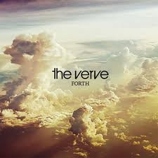
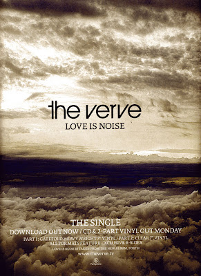
 This is the poster magazine advert for The Verve's first single from the album Fourth. The photography, even through slightly different works together nicely, changing the colours slightly to depict the feel of that particular song. Their album cover captures clouds with effects of different colours making the album feel relaxing but possibly a little bit trippy. The audience can expect epic, anthemic moments throughout. The magazine advert uses the same photo as the singles artwork as it's background so immediately the audience know what to look out for and recognize it in the stores. They use the same text as on the album artwork on the poster, keeping the information simple. Its informative by stating it THE SINGLE, its avaylable to download and buy on c.d./vinyl, then includes their website and producers logo. I think this is eye catching because the horizon draws the viewers attention aswell as telling them the release date.
