Monday, 6 December 2010

Magazine Adverts


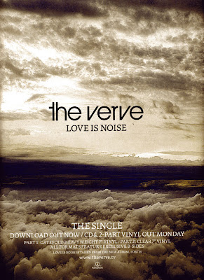
This is the poster magazine advert for The Verve's first single from the album Fourth. The photography, even through slightly different works together nicely, changing the colours slightly to depict the feel of that particular song. Their album cover captures clouds with effects of different colours making the album feel relaxing but possibly a little bit trippy. The audience can expect epic, anthemic moments throughout. The magazine advert uses the same photo as the singles artwork as it's background so immediately the audience know what to look out for and recognize it in the stores. They use the same text as on the album artwork on the poster, keeping the information simple. Its informative by stating it THE SINGLE, its avaylable to download and buy on c.d./vinyl, then includes their website and producers logo. I think this is eye catching because the horizon draws the viewers attention aswell as telling them the release date.


Sunday, 5 December 2010

video responce

" good shots but perhaps a bit more of a variety. At 00:20 when she's walking you could speed it up as its quite slow. I really like the shot of the car and headlights as the girl is walking towards the camera, this is a good effect. The fades between the tree shots are good too." - Louise (Media Student)

I agree with the comment that the shot of her walking in the distance is too slow tempo and the shot is too long with the slow music, when i re-shoot i will consider doing more close up shots of the character as thats a convention that most indie rock music videos follow. As this was a first attempt i only organized to use one model, but by using two this will give me a wider variety of shots and add performance into the video not just narrative alone.
I also think that the headlight effect accompanies the lyrics "light burns within" well and i will be using this same effect in the final video. This shot works together with the use of the torch so i think using light in interesting ways will be a major part of the video.
As the beginning of the song starts slow i think i will use the fade effect more frequently before the tempo picks up towards the middle.


Another opinion

"A few things I would look at or try

- more than one person. the torch sequence may look more effective with more people, the sequence with the car headlights that may also look effective with more than one person?

- 0:46 i like this as one person

- The fade from her face to the tree/moon i like

- are we ment to see the torch in her hand as it comes away from her?

- maybe try and get a field if that is where you want where there is less background i for one got pretty distracted by it.

Overall i think this looked like a worthwhile practice, Check out the editing pace and style, the bit going from the dark torch to the car was very quick i don't know wheher thats the ffect you were after though. maybe bring the car bt in when the singing restarts as i think i heard as 'as the light still burns within' which may make the footage more relevent?

The change in colour tone from 0:45 onwards i think is effective.

the shadow created on her face is nice,

Just an idea, after the shot of the tree maybe the next shot more people come in to the next shot so after the tree at 0:53 the next one is of the group.?

I think silhouettes will work well with the tone of the music. " - Mairead (Media Student)


I am glad someone responded to the colour editing of the piece. I tried different tones and shadows and highlights in the video to enhance the visual aspects and get a colour theme of dark blue and light orange and reds to symbolize the sad aspects of the music and to show its a story about two broken lovers who are confused about where they stand, hence the title 'delirious'.

As responded by these two viewers, they likes the light, shadow and silhouette effects rather then trying to follow a distinctive narrative which is the contemporary approach i was aiming for. To improve on this I will shoot more in the day light and use these dark and light effects towards the end of the song to keep continuity. I am going to introduce more characters and maybe even a large group of people to keep the viewers focused on the visual aesthetics rather than following a storyline.


Practice Video

Here is a minute of the first practice shots i produced before shooting the real music video. This helped me figure out that as it's winter it gets dark pretty quick, leaving me less than an hour to shoot after school so I have to think about the shooting schedule carefully. It gave my actress an understanding and feeling to the kind of things i need her to do, and the kind of character she is. The editing after allowed me to understand different length of shots, give me time to remember how to apply the transitions and effects and well as structure a good order alongside the music. overall i am pleased with the way this short slip turned out and i will carry on designing the rest of the storyboard using this narrative idea of a visually pleasing video featuring very sceneric shots and telling a broken love story.


After the final editing cuts, my media teacher analyzed the video and the first aspect we decided isn't effective is the long shot of her walking across the field. It has a too repetitive feel without a reason. To make the video more interactive with the audience it could be improved by putting in a pont of view shot so they get a better understanding of the character. This could be done after the shot of her stepping through the tree out into the open by cutting to a shot of the camera past the tree as a mid-shot of her still walking away, the changing the view to what she is seeing as she explores her surroundings. Another shot of the torch in the dark which i reversed i think is visually appealing but it's too dark and doesn't fit with the aesthetics of the other scenes. I am going to re-shoot all of these shots with the improvements to keep continuity. Even though my favourite shot using the headlights is an effective composition, again it doesn't fit with the rest of the video, and gives a kind of 'horror' feel as her arms are spindly and 'claw-like'. I am going to re-design the mise-en-scene and atmosphere i am trying to create to accompany the song.

Wednesday, 1 December 2010

Monday, 22 November 2010

digipack artwork

This album artwork is a brilliant representation of the feel to this particular album by Jimmy Eat World. Black takes over the majority of the cover, already showing the songs are going to be dark. the simplistic capital titles stay insignificant so the viewer focuses of the photography. The choice of monochrome shows this isn't going to be a happy album. The young man to the right hand side of the out of order phone box hangs his head although he's depressed, sad or lonely. I think what he is trying to say is that he's finding it hard to reach out to people, he feels low but want to feel happier. This is shown by the use of lighting, as he stand in rays of light coming from the phone box which isn't working. The audience will know this rock artist had produced a pessimistic themed album that is one to listen to on a rainy day.


Wednesday, 17 November 2010

Album Artworks: Illustration


The foals album, antidotes, is a rather simple illustration of a teenage boy. The portrait shows some real character as the guy is good looking, smart hair and the top button done up on his shirt gives him the geek chic look thats been popular these past few years. The text looks and written and scruffy making the bands appearance seem smart in fashion yet not so squeeky clean in their music style representing the british indie rock genre. The illustrations eyes are pale blue and shadowed making his face appear glum and sad, which could hint to the audience that the album is going to be melancholic. I like the mixed colours in his mouth, it adds detail to the plain album artwork and signifies that the singer has a lot to say in this album.

Album Artworks: Photography

This album cover is a controversial piece of art featuring an innocent looking bright eyes young girl dressed in a rockers leather jacket and holding a lighter. It features aspects of religious images such as the angelic girl, blonde hair, eyes connecting with the viewer and the flame, but is contrasted with aspects of the rock genre which becomes shocking to some viewers. a small child isn't usually associated with lighters, as smoking is something teenagers and adults do, making the album seem rebellious. it fits in with their choice of title, light me up, and gives the audience an idea about the feel of the bands music. The main signer of this heavy rock band is a young pretty blonde herself, and at the age of 16 singing alongside older male rockers, this has stirred up a lot of talk, attention and media. I think this a brilliant representation of the bands image and music style presented in a basic close up photo because of the symbolism used with the zippo, her attire and the contrast with her age and the image an audience would expect a pretty girl to wear. This would appeal to their target audience of teenagers interested in rock as well as grabbing attention from those who like the rock image and are interested in the lead signer, Taylor Momsen, as she acts in the teen drama GossipGirl.


Album Artworks: Text


album artworks


Tuesday, 16 November 2010

Final Storyboard so far...


Shot List


As i was listening to the lyrics of the song, i pictured the ideas i had created in the brainstorm and visualised how i wanted them to be shot. First of all i thought about the local fields, woods, gardens and toher areas local to me as i'm farmiliar to them and decided they would be a great setting to the video. As i have my Actress; Alice, and my Actor, Chris i could picture them in the scenes i want to create. By using the influence of the music videos i have analysed i could decided on the types of shots and the sequence i want them to be played in. This is the first shot list i created

Monday, 15 November 2010


This is the bands original EP album cover design. This is also the full song i have chosen and got permission to use for my music video. I will be designing my own digi-pack to accompany my style of filming while keeping the bands image and considering their unique style of sound.

How to make a paper boat

(one of my props)
Instructions:

1. Fold the paper from top to bottom, bringing together the two opposite ends.
2. Crease the folded end.
3. Fold the paper from side to side, bringing together the two opposite ends.
4. Crease the folded end
5. Unfold the paper once, noting the middle crease.
6. Fold the top left tip so that it touches the middle crease.
7. Crease the diagonal end.
8. This is what you should have now.
9. Flip the paper over.
10. Fold the other tip so that it touches the middle crease, and crease the diagonal end.
11. Fold one bottom flap upwards.
12. Crease this folded end.
13. Flip the paper over.
14. Fold the other bottom flap upward and crease the folded end.
15. Insert both thumbs into the middle of the folded paper and pull outward.
16. If necessary, tuck in the edges of the flaps.
17. Crease all folds. You should have a folded rhombus.
18. Holding the rhombus with the open side down, lift one bottom flap and make it touch the tip.
19. Crease the folded end.
20. Turn the rhombus over.
21. Lift the other bottom flap, making it touch the tip, and crease the fold.
22. You should now have a folded triangle.
23. Insert both thumbs into the middle of the folded triangle, and pull outward all the way
24. Crease all folds. You now have a rhombus.
25. Hold the two outer tips with your thumbs and index fingers.
26. Pull the two tips outward all the way.
27. When you have pulled the tips all the way, flatten the paper.
28. Crease all folds. This is what you should have.
29. Turn the boat upside down. Holding your fingers inside the boat, pull the sides out a little bit to make a wider base.
30. Now check that the boat can stand on a flat surface. If it does not, try to widen the base some more.

Sunday, 14 November 2010

Location & Actors

As I'm not using the actual band for my video I've got to find replacement artists and actors. As the band is relatively young i will use some of my older teenage friends to act as they fit the age profile of the target audience, students.

Possible actors:

Alex Gardener
Lewis Brown
Tom
Chris Nicolls (Accepted)
Cat O'Brien
Kenzie Brown
Jordan Matthews
Alice French (Accepted)
Leah

Location:

Jordans Village Green
Local Fields
Abandoned Farm


Props:

Bath Tub
Hose Pipe
Paper Boat
Smoke machine
Acoustic Guitar
Table & chairs
Cards & Chips
Drinks & Glassess


Costume:

Everyday casual wear for the guy
Tattoos
LOOK: Topman, Indie, River Island, (Popular student highstreet brand)

Ball gown dresses for the girl
over the top dramatic make up to represent the dark atmosphere
LOOK: Fairytale / Nightmare, Coutrue, Glamorous&Dirty

Friday, 12 November 2010

Shot list

Opening shots: plain shots of the locations
- river water running
- misty fields
- bath under a tree outside
- wooded area
Music picks up : Introduce band members / singer
- c.u of guitar playing
- e.c.u of singer lip syncing

Wednesday, 10 November 2010

Lyrics

As the lyrics weren't avaylable for me, i had to listen to the song closely to wrine them down. In doing this, it helped with with the structure of the song, and most music videos edit their different shots according to it's order. as this song is very repepetive i'm planning on shooting quite a few different situations to shot and work with to keep the audience interested in watching.


DELIRIOUS

Oheoeoeo ah,
Oheoeoeo ah,

Tell me you live, I live
'cos this light still burns within
With this slowely beating heart
And the thoughts don't go on for this

You took the worst of me
You left and now i'm free
To be what I wana be, yeah
( Hold on)
You took the worst of me
You left and now i'm free
To be what I wana be, yeah
( Hold on)

Oheoeoeo ah,
Oheoeoeo ah,

Tell me you live, I live
'cos this light still burns within
With this slowely beating heart
And the thoughts don't go on for this

You took the worst of me
You left and now i'm free
To be what I wana be, yeah
( Hold on)

I looked at better days,
when your name was finally erased, and
memories are faded
(oh no)

You took the worst of me
You left and now i'm free
To be what I wana be, yeah

I want it
I can't let go
I need this
and I won't let go

I want it
I can't let go
I need this
and I won't let go

Settings

I have chosen to work outside, in local fields as they are a close location to me as i live in the countryside. This allows me to capture beautiful natural shots in wooded area, allowing the winter weather to create the dark mood of the piece. As the song is acoustic, i've planned to edit the film maintly into slow motion to match the tempo of the music. these are the different scene I have visualised and plan to cut between within the video.

* girl in huge gown traveling through trees and fields
* close ups of singar/main character playing guitar with other band member out of focus
* plain wall room, use smoke machine/ project images onto him as he sing/plays
* girl digs and find burried box of memories (contains paper boat)
* guy burns love letters
* passes tree with their ninitials engraved
* bath under tree outside
* let paper boat free down river
* social setting (pub/table of friends/sofa at party)

In gratitude


The band In Gratitude go back to me by email and gave me permission to use any of their songs for my video.

IDEAS.
I started to put down my visual ideas as i listened to the song and the shots and scenery came to me after repeating it over and over again. I decided to go with a visually appealing narrative music video. This is because I have a creative mind and as i study art and photography, i thought i'd incorperate those skills into this peice of work as i've never done anything like this before.
I am going to use two main subjects, a teenage girl and a young male vocalist who used to be her lover. The song is from the guys point of view put in the video i will shoot both side of the story.
Mise-en-scene is very important to my idea as i want the video to feel like a fairytale nightmare. a very atmosphereic moody feel to the piece with abstract ideas made into film.

Tuesday, 9 November 2010

Change of Plan

I have had a mental block when it came to having to change my idea for the music video. It's been hard to work around my original plan as I was so passionate about it. As I attempted to film live and work by doing shop-motion i have decided it would be best to come up with a new idea if i started over with a new song.
I went back to my first research in local bands and took a listen to their music again to get inspired.
The bands Francesqa and In Gratitude caught my eye as have both release new songs recently so promoting them with a music video would help the band as well as me with my coursework. I have emailed both bands, and their management to obtain permission to use one of thier songs. These are the emails..

-----------------------------------------------------------------------------------
Permission to use song:

I've contacted you as Francesqa's management to ask permission to use one of their songs.
I have seen Francesqa several times in High Wycombe and really enjoyed the performance, so when it came to finding a song to use for a music video I took a look at their music.
I'm a student on my last year of A level and it is my Media studies coursework project to create a music video. I really wanted to use a local bands song and help a little with promoting their music as the video can be put onto YouTube.
My first choice would be to use 'Boy', and two others I like the sound of are 'We Lived' and 'Move your Hands'.
Please let me know If i am allowed to work with one of these

Thank you and hope to hear from you soon

Lauren,

laurenashleighquinn@gmail.com

----------------------------------------------------------------------------
I have seen In Gratitude several times in High Wycombe and really enjoyed the performance, so when it came to finding a song to use for a music video I took a look at your music.
I'm a student on my last year of A level and it is my Media studies coursework project to create a music video. I really wanted to use a local bands song and help a little with promoting thier music as the video can be put onto youtube, and I am asking your permission to use one of your songs.

The first choices of mine would be

* Delirious
* Always
* In All Dishonesty

Thank you and hope to hear from you soon

Lauren,

Tuesday, 2 November 2010

Digipack cover designs

Digipack example


Here is an example of another level 4 students digipack. A digipack should be four or six frames, and the magazine advert should follow the convensions in terms of promotion of the product.

***analyse***

Monday, 1 November 2010

Looking at Lyrics


I listened to the music and pin-pointed the times where the music has a distinct different sound such as when the singer comes in, or when the drums start. The different layers of sounds make up different atmospheres along the time period of the song, so by cutting it into sections i can design my scenes to accompany the texture and volume of the sound. Matching images to sound this way will help me with the editing afterwards,

Band Interview

Seeing as I am working with their song, and possibly with the band themselves, I thought learning more about what's behind the lyrics is important. I have seen them perform live a few times now and they give off so much energy on stage and perform with as much passion throughout their long line up of songs. The front man, Calum Wood has the audience doing call-and-response chants and the musicians strum melodic guitar tunes. The chorus to Right Place at the Night Time has a very catchy chorus and when they make their music, it fills the room with loud emotion.
They performed at a Jack Wills store which brought them a lot of attention and followers on their Music Myspace page. This local band of four are a true inspiration and all round great to listen to. It's my job to turn their tunes into visual art through the form of a music video. As the song i've chosen is almost 5 minutes long, I have to give a lot of attention to detail in the amount of cuts and shots i take.

**INTERVIW FROM AMAIL HHERE**

The XX- Crystalised


Analysis- Gloria


The band Canterbury is one i have seen many times live as they originally formed in my local area and performed in High Wycombe. Since then they have become big, been offered contracts, been on tour around Europe and have recorded a few videos. This is their newest addition, which i immediately connected with because of its simplicity. The concept of showing them perform in slow-motion is cleaver and done in one continuous shot is unique compared to most music videos. The mise-en-scene is also simple, a corner of a studio with their instruments set up and the band members walking in as the song starts is easily produced yet effective. The editing of black and white i think completes the video and makes is appear more professional as the image is sharp, giving of a very vintage style recording juxtaposing with the modern music.

Analysis- Ghosts

Formally known at Francesqa, this local band holds a fair few decent videos. I have seen them perform twice this year, and they have gone onto bigger things, but stay local still. Their most recent video i chose to look has a very copy-cat feel to it. Consisting of Performance and a narrative following the singer, I felt when watching this video It had nothing special about it. What i liked best was the editing. The cuts and amount of shots suits the song well, and the after effects of the old film colour speckles add a creative touch.

Thursday, 21 October 2010

Analysis- Daisy Dares You


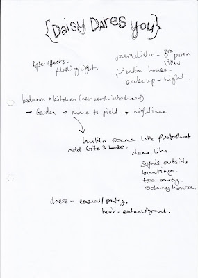
The opening mid-shot reveals a kitsch girls room filmed being held by hand and edited cuts of different angles with flashes of pale colours making it feel surreal like a dream. Close up shots of the bed reveals many teenagers appearing from under the cover waking up. The video starts in a chronological order of the day. Here the characters are presented as daisy's friends and they have breakfast and start the day. The day consists of taking many obscure objects to a field to have their own little party.

Tuesday, 19 October 2010

Analysis- Decode


Practice shots

Here are the practice stop-motion short videos i attempted as an idea as part of my development.

*****upload vid*****

These ideas didn't turn out how i had planned. I was glad i practiced before the real filming because the sparklers didn't last as long as i thought so there wasn't much time to capture them in motion. I planned to shoot at sunset, so at 6.30 I organized with my model to meet but the light disappears in half an hour which wasn't enough time to film in. The idea was to take continuous shots of people dancing and jumping, the sparklers acting as light and decoration but the pictures wouldn't take fast enough so the images didn't flow like a video would. I have to reconsider the lighting of shooting late outside as i realized this wouldn't work well. The lip syncing didn't go well either for the same reason that the continuous shooting wasn't fast enough to enough capture pictures to allow the audience to recognize what they are saying.